This in process project emerged from the Expert Class Type Design delivered both in person and online througout 2021-22
After our trip to Antwerp to visit the Museum Plantin-Moretus, and the constraints on travel imposed by covid-19, I realised I was not going to be able to undertake any more on the ground research in Belgium and turned to my local context – researching the history of type in Scotland. I noticed several boxes marked as Scotch Roman in the workshop of Patrick Goossens and this served as a spur for further investigation.
The Scotch Roman fig. 1 emerged at similar time to the type cut by John Handy (1754–1780) under instruction of John Baskerville (1706–1775) – part of a class of typefaces that became known as transitional. Taking the roman letter form and rationalising the serifs and adding more contrast – not yet going as far as the modern faces of Bodoni or Didot. These shifts in how type was cut were partly informed by the improvements in paper production offering a smoother surface and allowing for a clearer reproduction of the letter form.
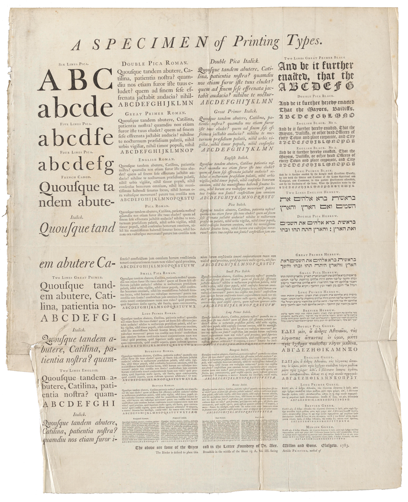
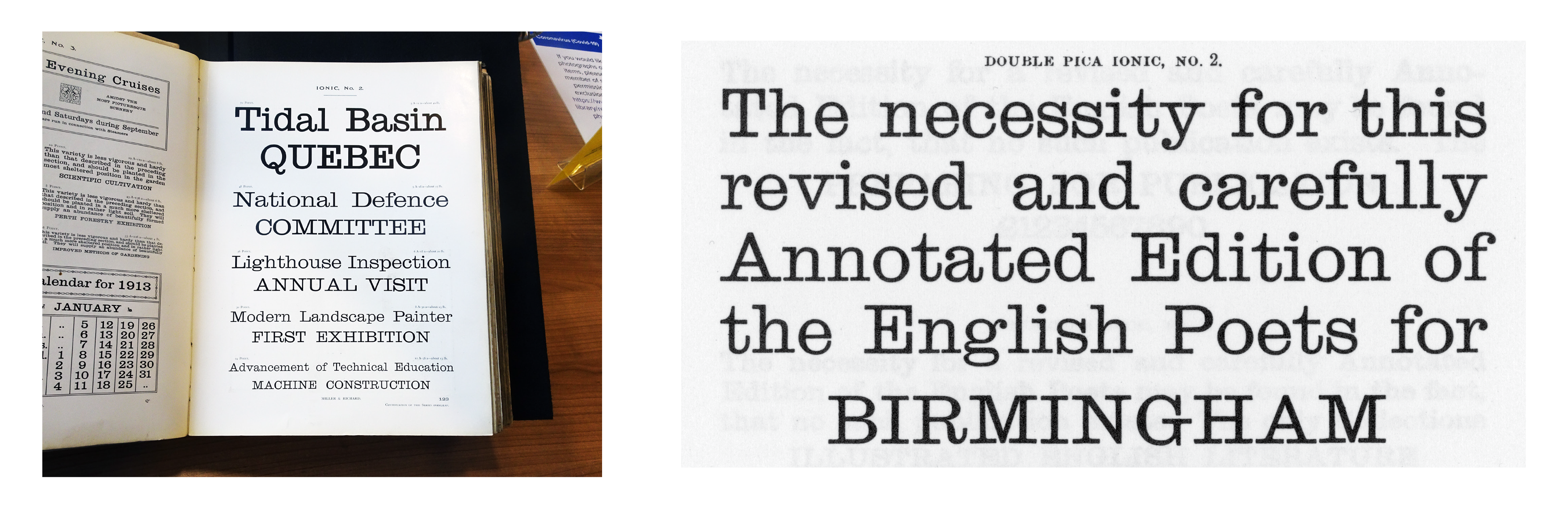
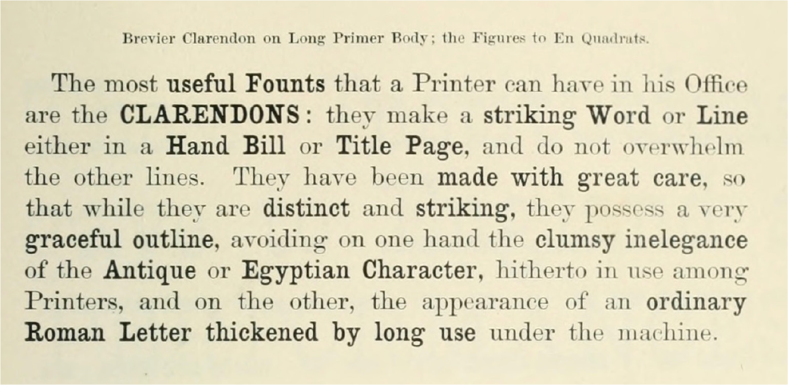
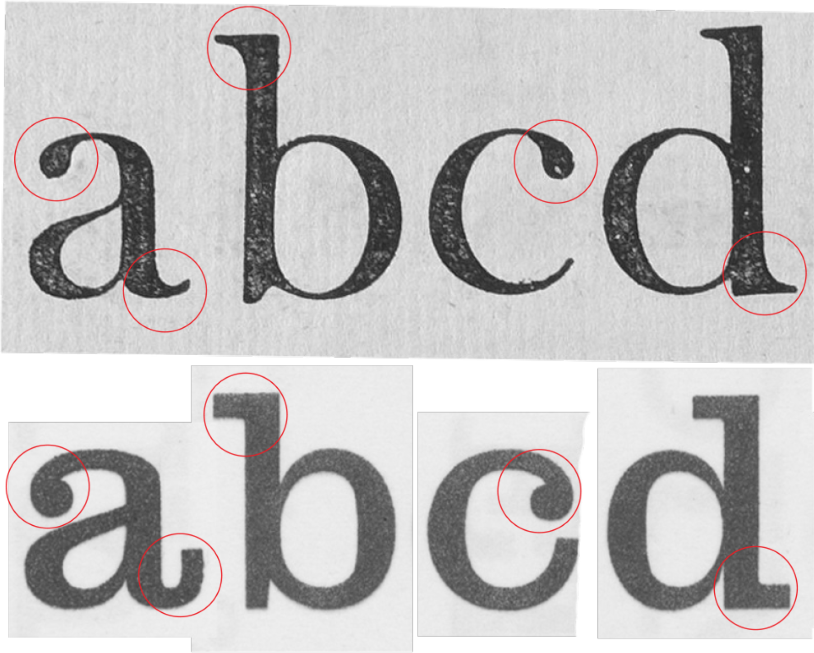
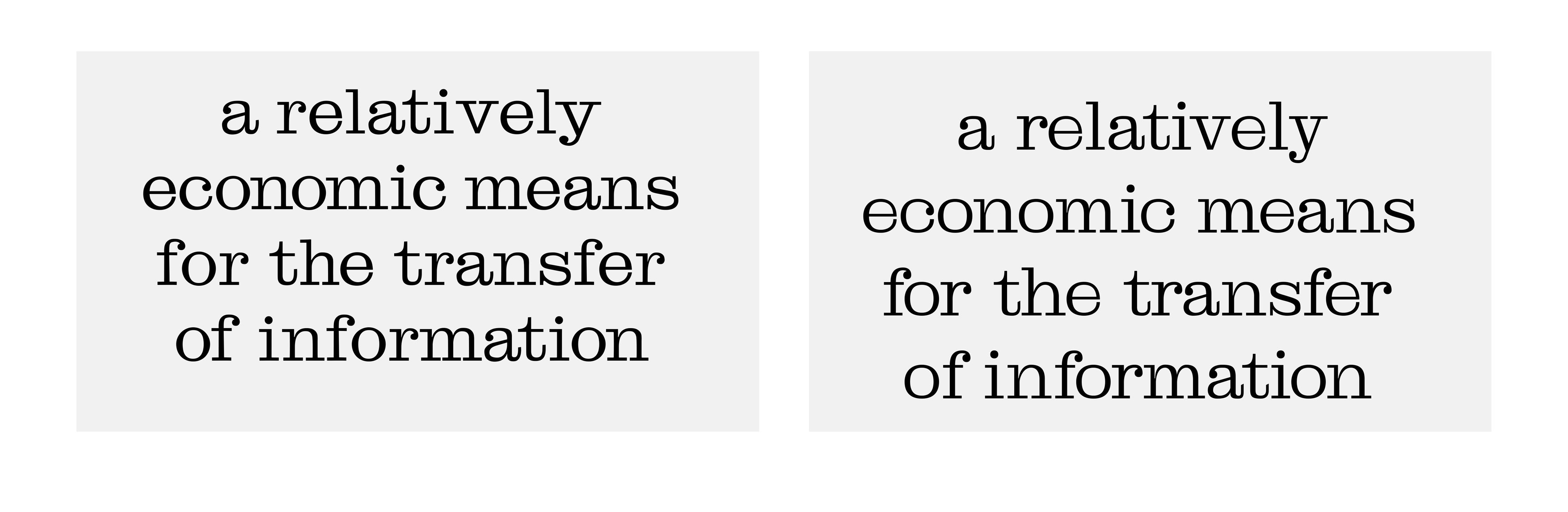
I undertook a number of research visits to the National Library of Scotland to consult their holdings related to Miller & Richard, mostly a number of editions of Printing type specimens, comprising a large variety of book and jobbing faces, borders and ornaments fig. 2 from 1840 to 1936. Initially I had looked at the Old Roman and considering undertaking a revival, however on reviewing my material further I found myself drawn back to the Ionic, a slab serif with low contrast and a slightly awkward appearance. The Ionic is similar to the Clarendon and was originally used in running text to add emphasis fig. 3, prior to the introduction of different weights. I was particularly interested in how it took the rationalisation within the Scotch Roman to extremes fig. 4 with the serifs elongating, the ball serifs becoming dots and the tail of the /a and the /t becoming almost comical in their extension.
Initially I redrew the character set fig. 5 fairly faithfully from the material that I had collected from the library. After presenting and receiving feedback from Dr. Frank Blokland it was clear that it was a bit all over the place in terms of spacing and stem width. I went back to the source material and tried to apply some of the theories that Frank had been teaching us, however it was clear that this was not the finest type.
I tried to locate some further information about the Ionic communicating with the St. Brides Foundation and The Type Archive in London, it seems that when Miller & Richard closed some of their stock was sold onto Stephenson Blake. However they would not have a need for the Ionic having acquired the holdings of William Caslon who had a far superior version. One could speculate that at the point that their Ionic was produced Miller & Richard had maybe lost some of the knowledge and skills of the early punchcutters they had worked with.
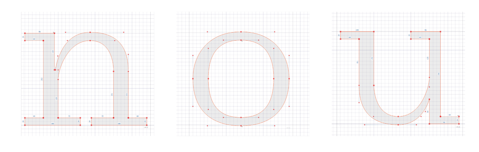
I went back to the drawing board and decided to investigate instead what would happen if one took some of the idiomatic features of the Miller & Richard Ionic and applied them to a more rigorous grid.
I established a base grid of 12 units with stem widths of 36 and serifs at 24. After blocking out the basic letter forms I realised that there was a chance to play with this construction. I added in custom variable axes for the bracketing of the serifs (the meeting of the stem and the serif), and the length of the serif including the option for removing it entirely. This can be seen on the main section of this site at the currently offering a limited set of glyphs
The Expert class Type design has equipped me with a more realistic understanding of everything that goes into the production of type and the time that it all takes. What is presented here is very much in progress and I intend to work on this project going forward. In the future I intend to produce further weights playing with the possibilities of both interpolation and extrapolation within variable fonts.